divide what you got in #1 by what you got in #2 (sum/number of values)
That's your mean!
Try it yourself:
2+2+6+8+13+14+17=62
There are seven values, so you divide 62 by 7.
The mean is approximately 8.86.
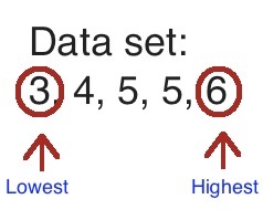
The median is literally the middle number. (With a catch, so read it all)
The median here is 8, because it's in the middle.
YOU MUST PUT THE NUMBERS IN ORDER!! The #1 mistake students will make when calculating median is just picking the number in the "middle" but you have to put them in order first.
The mode is the number that shows up the most.
Since 2 shows up the most, it is the mode. You can remember this because MODE sounds like MOST.
Measures of variability
The measures of variability are range and interquartile range.
Range is the highest number - the lowest number.
The range here is 3, since 6-3=3.
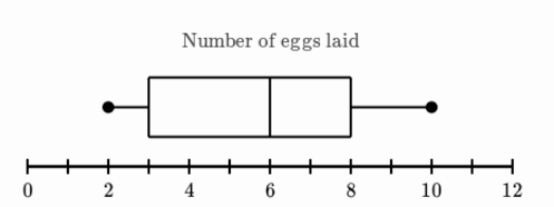
Interquartile range is found on a box plot.
Interquartile range is found by subtracting the upper quartile - the lower quartile. This is the upper end of the box - the lower end of the box.
In this case, the upper quartile is 8 and the lower quartile is 3. This means that the interquartile range is 5.
Statistical questions
A statistical question is a question that, when asked to a lot of people, will generate numerical data.
That's a fancy way of saying that people will answer your question with a number. Here is an example a a statistical question: How many video games do you own?
This is statistical because people have an AMOUNT of video games. Statistical questions usually involve phrases like how many or how much.
Box plots, dot plots, and histograms
Box plots
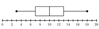
The lower extreme, or minimum, of this box plot is 3. The lower quartile is 7. The median is 10. The upper quartile is 13, and the upper extreme, or maximum, is 18.
The lower extreme is literally the smallest number in the set. The upper extreme is the largest number in the set. Your next step is to find the median. The median is the line inside the box. Your next step is to find the median between the lower extreme and the median. This is the lower quartile. Do the same with the median and upper extreme. This is the upper quartile.
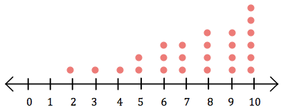
Dot Plot
This is a dot plot. You basically put a dot over every number per time you have it. Dot plots are fairly easy to make and read.
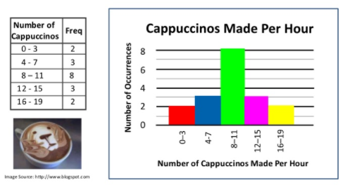
Histograms (not instagrams)
A histogram shows the amount of data points between intervals. This is a good histogram because it does not repeat numbers in intervals.
A frequency table is made to show the interval and how many data points are in the interval, except it is in chart form. Always make a frequency table before making a histogram.